Question 4:How did you use new media technologies in the construction of research, planning and evaluation stages?

The film industry has advanced massively due to the advancement in digital technology. Due to technologies such as CGI, created in 1973, HD cameras and dolby digital sound, films have become a lot more realistic, which makes films more appealing to audiences and therefore advancing the film industry. A classic example of this would be Avatar (2009) which held off being filmed for 7 years in order for the appropriate technology to beavatar cgi created in order for the film to meet the expectations of the director. This was wise of director James Cameron as the film box office sales is at an estimated $2.788 billion. This shows technology sells and I feel the more technology in films advances, the more the film industry will grow. Below is a prezi which explains how technology has impacted my short film:

prezi 2.0

https://prezi.com/3razbaomvcfr/how-did-you-use-new-media-technologies/

Evaluation Question 3: What have you learnt from your audience feedback?

Audience feedback is incredibly important within the film industry, especially in regards to the target audience, and finding out what they like and dislike. Audience feedback is very important for the film industry because if the audience doesn’t like the film, they’re not going to watch it-which means the film will not make any money. The film industry gets feedback in a number of ways, through things such as focus groups, test screenings, from box office sales, film reviews ect. They spend lots of money on this in order to guarantee the film is going to be a success.

The first part of audience feedback I revived was back in October when we was coming up with concepts for our short films and pitching our ideas too our peers and teachers. This was very helpful as it helped us expand our ideas and help clarify them also- it also helped us put a more realistic perspective on the short film and helped us realise what we was able to do and what wasn’t possible.

I then held a questionnaire on the film posters I created, in which 10 people participated. I asked the questions

questionaire

  • Which poster do you like the best?
  • What is your gender
  • What is your age?
  • Who do you think the target audience for this film is?
  • What do you think the film is about?
  • What do you think could be added to the poster to make it reflect its target audience/ genre more?
  • Do you think the tag line ‘you can’t wash away your mistakes’ is appropriate for this genre/ poster? Why?

Statistics

pie chart

  • I had 4 boys answer, 6 girls
  • 3 people over the age of 30, 6 people aged 16-18, and 1 person aged 12-15.
  • all 10 people said girls aged 16-25 for target audience
  • 7/10 people said the film was about heartbreak, 3/10 said a relationship
  • Suggestions of what could be improved, included putting a tear under the eye in poster 1, add the tag line to the other two posters, and put in something that would hint more at the ocd, change the font to be less harsh and give a more ‘indie’ feel
  • all 10 people liked the tag line

The feedback helped me have a better final poster and I now knew which poster appealed to which audiences, the black poster with Megan and Luka’s half face on it mainly appealed to the boys I asked so I therefore knew that that poster did not appeal to my target audience. The feedback also helped me understand what the target audience was looking for in a poster, so I could then therefore modify mt poster to meet the audiences needs, for example I changed the title from a type writer font to a font more similar to the font used in the titling in the film.

I also gained audience feedback on the short film from people who are taking level 2 media in my school. The majority of these people were not the target audience for our film so it was interesting to hear what they said:

This slideshow requires JavaScript.

We also decided to ask a boy of our target audience age range, a girl of our target audience age range and a woman just outside of our target audience age range:

From the audience feedback I gathered that the weakest part of the film was the second to last scene in the film in which James was talking to the camera on a white background. I feel like this scene could have been really emotional however, because Luka wasn’t a strong actor he could not channel enough emotion to make it believable.

I didnt gain much feedback for my review, I mainly just had feedback from my teacher giving me advise on how to make the writing style sound more like Little White Lies- which was obviously very helpful.

I feel like the most useful form of feedback I received was from the showing of the ideas and planning to my class I which I received feedback from my peers and teacher, which was the first lot of audience feedback I received. I feel like this is what helped shape the film and helped me put the film into perspective, showing me what was doable on the budget and equipment we had.

If I was to remake the film I defiantly would have chosen a different actor to play James’ character to really bring up the film and make it as emotional as its potential. I would also change some of the camera work as it is too out of focus in some points.

Overall, I think audience feedback is very important whilst making a short film as it helped me understand what the audience wanted from the film and also helped me improve and change the film in order to be as appealing to the target audience as possible.


Question 2: How effective is the combination of your main product and ancillary texts?

By combining three products together (a film, a poster and a review) I was able to make all three products support each other, they work like a triangle. The poster was used to triangleadvertise the film-without it no one would be informed about the film. The film is obviously the film, and the poster an review wouldn’t be needed without the film, and the review is to inform the audience about what the film is about- most people wouldn’t see a film if they didn’t know what it is about. Therefore combined they are a final product which supports each other. Our production company is called eccentric productions, which is an independent production company which focus’ on British independent short films, it will be distributed by  Dazzle short film label,   dazzle is an independent short film label, which handles the exclusive distribution, exhibition and sales rights for a selective catalogue of award-winning, critically acclaimed UK and international titles. From 90-second, digital micro-movies to super-35mm masterpieces, dazzle’s bijou short film collection is often provocative, always original and sure to inspire.

Film review

LWL review lauren

Our final product that we had to make is a film review, however we had to write it in the style of popular film review magazine”little white lies”- which has a very specific tone and writing  style to it. I found it quite difficult to write in the style of little white lies as they write kind of in the style of that posh drunk aunt you have, using formal but in formal language and using tones of big words and alliterations. Once we wrote our review we had to make the layout the same as little white lies, which I did on Photoshop.

Below is my final draft for the film review:

How do you salvage a relationship on the rocks, whilst also suffering with OCD? 1.2% of people are affected with this mind controlling illness in the UK; Eccentric Productions emotional and powerful new short explores the difficulty of committing to a relationship whilst your obsessions are getting the better of you. Originally inspired by Neil Hilborne’s tear jerking poem ‘OCD’ director Lauren Murphy visualises the harsh reality of suffering with OCD, and the impact it has on your loved ones in her beautiful conceptual debut film.

The main character James, (portrayed by Luka House), who is reserved and appealingly awkward, is head over heels in love with Lauren (portrayed by Megan Richards). The two hopelessly fall for each other in a very short space of time, however, as James’ OCD starts to show- so do the cracks in the relationship.  Lauren initially finds James’ ticks and vulnerability simply adorable, however as time goes on and his OCD worsens, Lauren is faced with the difficult dilemma on whether she can actually cope with James’ mind straining obsessions and mannerisms.

Lukas’s downhearted voice over lyrically compliments the imagery of the downcast breakdown of his relationship with Lauren in a well-spoken voice over. This has also been fabulously portrayed through crisp wide shots of scenery and intriguing close ups.  Despite some of the camera work looking utterly ravishing, although some is lost in a fog of mediocrity-looking like camera woman Gina Bhardwaj doesn’t quite know where the focus button is. The editing in this short really makes it, reflecting the obsessions and ticks of the narrator with its repetitions- the viewer can being to feel the discomfort themselves. It looks to be inspired by the editing of Darren Aronofsky’s psychological drama ‘Requiem for a Dream’.

The acting in ‘On and Off’ comes second to excellent in parts reflecting on the great direction from first time director Lauren Murphy. Megan Richards portrayal of Lauren is simply beautiful, her journey through coping with James’ constant ticks is an emotional rollercoaster for the audience and her angelic face makes us fall in love with her. Luka House’s performance however was very disappointing, whilst having a tolerable performance at the beginning of the short, it just seems he lost touch with the character- (and the rumoured breakdown of relationship with director Lauren Murphy really shows) this lowers his performance towards the end of the short. His acting in parts were completely unbelievable, director Lauren Murphy quoted “He was a nightmare on set- he was late to his scenes, constantly going on cigarette breaks and lost focus every 5 minutes, needless to say I couldn’t wait for the filming to be over!”. We think this could be the end of Luka House’s short lived acting career.

Overall, a heart-breaking piece which has been beautifully scripted, directed and edited which can be seen to make up for the clunky camera work and partially  poor acting, it has tackled a very sensitive issue very appropriately and will hopefully shine a light on young people suffering with OCD. To summarise it is a well-deserved entry to this year’s London short film festival and we wish Lauren Murphy every success- she’s one to watch!

Roles in magazines

magaz

Editor

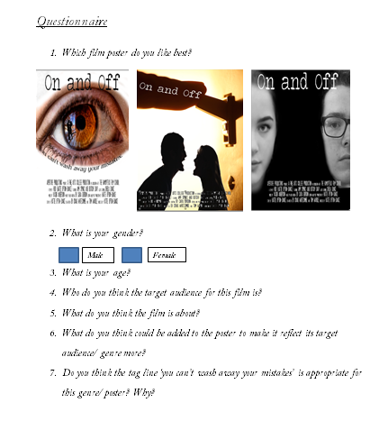
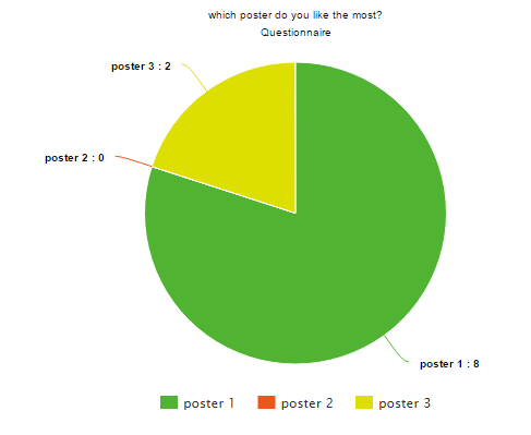
In newspapers and magazines, the role of an editor is likely to be managerial, with responsibility for the entire content. Junior editors on the same title might be in charge of sections, such as sport, fashion or news.

Roles- Editors are also responsible for:

  • making sure that the production process runs smoothly
  • making sure that publications are printed on time
  • recruiting staff
  • liaising with the advertising and production departments.

Salary-A local newspaper editor may earn around £16,000 to £25,000 a year. Experienced editors and commissioning editors can earn up to £40,000. Editors working on national titles may earn over £100,000 a year.

Qualifications– Most editors have worked their way up from junior roles, often in the journalistic field. Work experience is vital to finding the first job in the industry as it proves commitment and appropriate skills to an employer.

Graphic designer

A graphic designer creates the graphics primarily for published, printed or electronic media, such as brochures (sometimes) and advertising.

Roles-roles of a graphic designer includes

  • estimating the time required to complete the work and providing quotes for clients;
  • developing design briefs that suit the client’s purpose;
  • thinking creatively to produce new ideas and concepts and developing interactive design;
  • using innovation to redefine a design brief within the constraints of cost and time;
  • presenting finalised ideas and concepts to clients or account managers;
  • working with a range of media, including computer-aided design (CAD) and keeping up to date with emerging technologies;
  • proofreading to produce accurate and high-quality work

Salary– Starting salaries for junior graphic designers can be in the region of £15,000 to £19,000. Once you’ve gained some experience, this can rise to £27,000. At a middle level, you can expect to earn £25,000 to £35,000. Salaries for senior graphic designers or creative leads range from £35,000 to £55,000. A creative director can make £60,000+ a year.

Qualifications– Relevant subjects for graphic design work include those that involve visual arts. In particular, a degree or HND in subjects such as 3D design, fine art, graphic design, photography, and illustration are recommended. Some roles don’t require a degree or HND, as job offers may be based on the standard of portfolio work and not on educational qualifications. However, progress without formal training is extremely difficult, and the vast majority of graphic designers have higher qualifications.

Advertising manager-

Advertising, promotions, and marketing managers plan programs to generate interest in a product or service. They work with art directors, sales agents, and financial staff members.

Roles– Advertising managers perform a variety of job duties, including:

  • Consulting with clients to determine how to improve market share and sales
  • Gathering and organizing information to help with decision-making regarding media placement, campaign length, featured products and services, and technical details
  • Ensuring that a client’s needs are met and any concerns are addressed
  • Staying in close communication with the client, answering questions, explaining strategy and providing status updates
  • Obtaining client approval on projects
  • Communicating client feedback to the creative team
  • Working to increase agency revenue by recommending new promotional opportunities or additional services

Salary– The average annual salary for advertising and promotions managers was $112,970 (£79,402.09) as of May 2013, with the top 25% of earners receiving more than $145,000 (£101,914.70). As with other professions, salaries tend to be higher for individuals with extensive experience and advanced education.

Qualifications- Most entry-level advertising positions require a bachelor’s degree, although some organizations may favour candidates with a master’s degree. Aspiring advertising managers can consider pursuing internships, as agencies often seek applicants with relevant experience. An advertising manager career can begin with a bachelor’s degree in Business Administration with a specialization in Marketing. Coursework typically includes principles of management, advertising management, electronic commerce, statistics and principles of marketing.
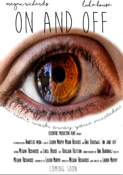
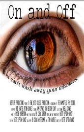
Little White Lies

Little White Lies is a London based film review magazine which was established in lwl3
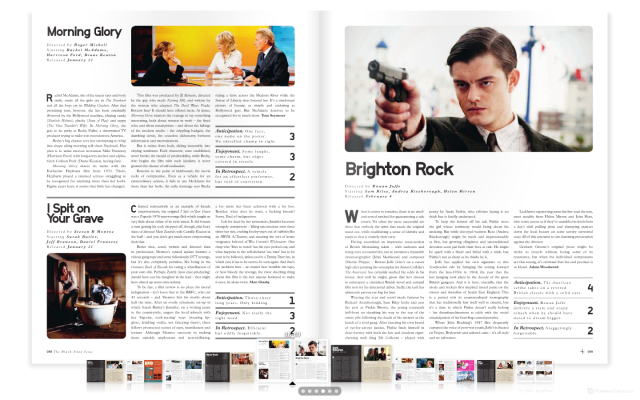
2005 with a sole aim to capture the excitement of films, it is renowned for its witty writing style and striking illustrations. They are seen to have a more indie target audience, ones who particularly appreciate the art of film making and therefore they mainly focus on the independent film genre. They describe themselves as  “a bi-monthly, independent movie magazine that features cutting edge writing, illustration and lwl1photography to get under the skin of cinema. Because movies don’t exist in a vacuum, we venture beyond the boundaries of the big screen, exploring the worlds of music, art, politics and pop culture to inform and illuminate the medium we love.Bold, beautiful and unique, LWLies is a magazine on a mission – to reshape the debate across the movie landscape.” Little White Lies dedicates each issue to a film that is soon to be released, drawing inspiration from the themes and visual Issue_23_RGBtone of the carefully selected film. The back section features essential reviews of the latest movie releases, plus exclusive interviews, festival reports and more. Many issues have been focused on critically acclaimed films such as ‘Tomorrowland’ and ‘Twilight’. Little white lies designs the whole magazine in the style of the the film they are reviewing, including illustration’s lwl2and in depth reviews. Little white lies is different from the more mainstream magazines as unlike mainstream magazines, little white lies also likes to focus smaller independent films, which is quite refreshing as it helps out smaller names in the business getting their films seen.I will be writing a review in the style of a little white lies review, which I find very daunting as English is not my strong point! I will defiantly be reading lots of LWL reviews and making a glossary of common phrases in order to get their quirky writing style correct.

lwl5.png

Creating my Film Poster

The time has finally come to start creating our final film posters, and after gathering audience feed back for which of my three posters I should use, it seemed everyone liked poster three the most which is this one: poster 1

We had to use our own images to use in the poster as the pictures could not be copyrighted, so I had to make a new silhouette to use in the eye, therefore I used an image of Megan and her boyfriend Harjan (who was Megan’s new boyfriend in the short film) and made a silhouette from that. This was the original picture:

final poster sc 3

I firstly removed the background from the picture by using the magnetic lasso tool around Megan and Harjan and then deleting the background. I then applied a mask and removed the remaining background that the magnetic lasso tool had missed with the paint tool, the black paint brush removes the image and the white paint brush brings the image back.

final poster sc 2

I then selected the image and filled it in black to make the silhouette, and then went round the parts which needed refining with black paint.

final poster sc 1

I then took the eye image from my draft poster and added it onto a black background, and then used the blurred paintbrush tool to remove the harsh edges and make it fade into the blank background.

final poster sc 4

I then duplicated the silhouette and added it into the reflection of the eye.

final poster sc 5

I then decided that this was too dark and was almost competing with the pupil, and I also wanted to make it look more like a reflection so I turned the opacity down to make the silhouette more transparent.

final poster sc 6

I then added titling, actors names and credit blocks. For the title I used the font ‘moon flower’ from the website ‘Dafont’

final poster sc 7

I then used the font ‘shorelines script’ for the actors names.

final poster sc 8

For the tagline I wanted it to look like it was almost the eyes eyelashes therefore I wanted a very whispy font, I thought ‘fox in the snow’ was prefect as it was very dainty and flowed nicely.

final poster sc 9

I then wanted to warp the text into the shape of the eye, I achieved this by right clicking on the mouse and then selecting ‘warp text’, after that I chose the shape I wanted my text to be, in this case it was arch, I then changed the bend to -50% so that it would turn upwards and fit the shape of the eye.

final poster sc 10

final poster sc 11

I then created the credit block using the font ‘SF movie poster’, and making the roles in the font 25 and the names in the font 35 to give the credit block a realistic feel.

final poster sc 12


Poster Drafts

After practising with Photoshop we was then given the task to create three poster drafts, we could either draw them or do unrefined drafts on Photoshop, and as I cannot draw to save my life, I decided to use Photoshop.

I initially couldn’t come up with any ideas, so I asked Gina and Megan what they was going to put in theirs for inspiration, they both said they was going to include light switches in theirs, so I took to google images and looked for a picture of a light switch I liked, I wanted someone turning it off and eventually found a picture which I liked, I then saved it and opened it in Photoshop and started playing around with it. I initially wanted to put faded out images of Megan in the white  part of the image, however I tried this and it looked terrible! So instead I added a silhouette of a couple arguing over the bottom. I had already decided that I wanted the title to be in a type writer font so I went to dafont and selected the one I liked and added it to my poster.

For my second poster I took inspiration from the poster for the Curious Case of Benjamin Button, I liked the idea of the two faces being on the main centre point of the poster and nothing else happening. I selected the pictures I liked of Megan and Luka and used the magnetic lasso tool to remove their faces from the background and then duplicated the images onto the background and then of course added the title and credit blocks. I like the simplicity of this idea and feel it makes a really effective poster.

I have no idea how I thought of the idea for the final poster, however it is my favourite poster. I like the idea of having a refection in the eye as it seems like it is revealing something to the audience that they shouldn’t know. I also included the tagline in this one which is ‘you can’t wash away your mistakes’ which is a play on words as Luka has OCD. Overall this is my favourite poster, and depending on the audience feedback I feel this is the one I am going to use as my overall poster.